Survey Wall Overhaul
Revamp of survey wall experience
Overview
Background: Our Survey Wall (Respondent) experience is the forefront of how TapResearch interacts with it's vast network. User's come onto our Survey Wall and answer questions, being rewarded with in-game currency (based off the game they entered from). The company was looking to get more users into their experience and keep them longer.
Challenge:
Design new features that would keep users staying on longer or returning more without upsetting the game publishers by taking their user's away for too long.
Update look and feel in a crowded market to stand out.
Fit lots of information and varying content string lengths into small space.
Solution:
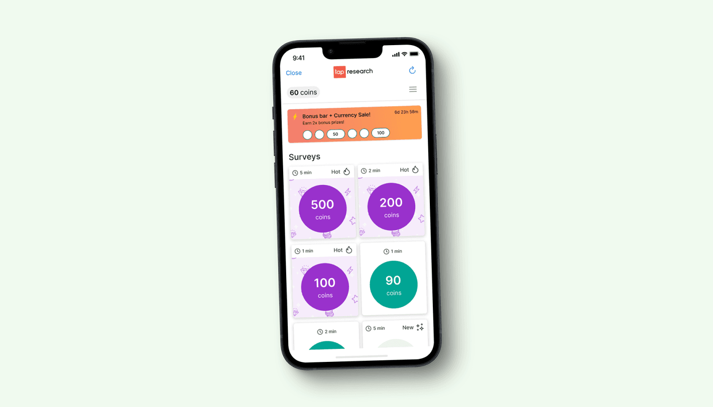
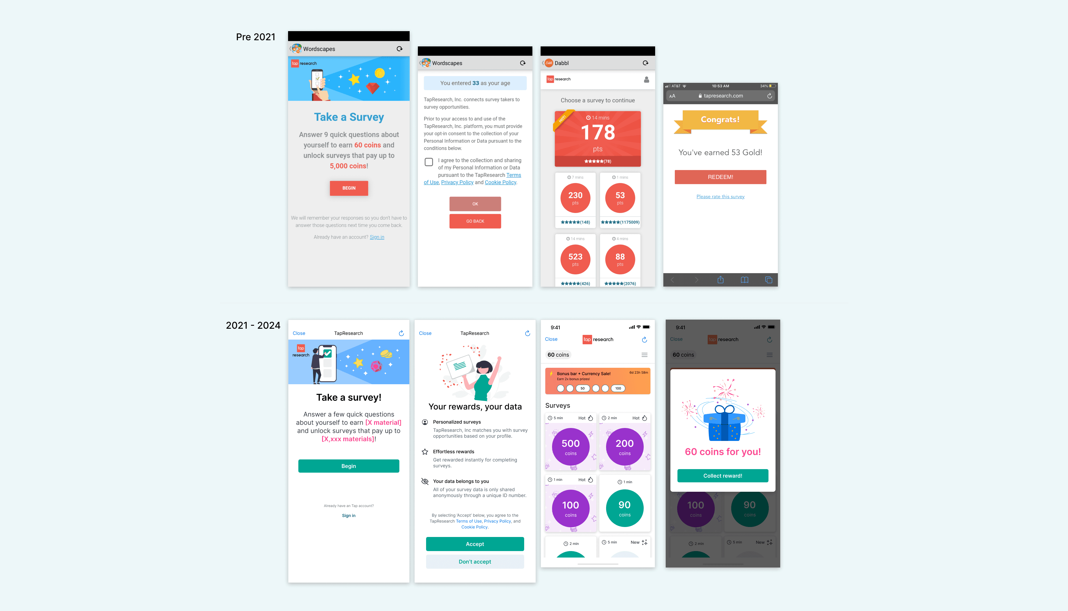
Bonus Bar: We designed a new component that rewarded user's for taking more surveys. A small bonus was rewarded after completing 3 surveys, a larger reward for completing 3 more. The Bonus Bar rewards would reset every 7 days with a timer showing the countdown until reset.
New nav bar + new colors: We added in a new nav bar showing the user's how much they've earned this session, making it easier to see the value they were while using our experience. I reviewed competitive experiences and looked to find a color palette that would be inviting but standout from the other experiences.
New tiles: Our new tiles went through several iterations until we landed on something that pleased our audience and saw a rise in metrics being tracked. Ultimately we increased the size, kept the double columns, removed several pieces of information displayed on the older versions, adde din iconography and new colors.
Outcome:
With the Bonus Bar alone we saw a customer engagement lift of 10% and with the redesigned survey wall we saw a revenue lift of 6% MoM. Customer and Publisher feedback was extremely positive.
